Orbit
A Better Way to Discover Local Events
Orbit is a research-led event discovery project designed to improve how people find and plan social experiences in Vancouver

Vancouverites miss out on events because local event information is fragmented and difficult to find
Understanding the Problem
My team and I originally set out to create a community-building platform. However, our research told a different story.
Through a city-wide survey we found that most people wanted to attend more events, but poor discovery meant they kept missing them.
Despite how much is happening in the city, the same message came up repeatedly: "I didn't know this was happening".
We followed where the research led and refocused our direction toward improving event discovery in Vancouver.
My Role
UX Designer
My Responsibilities
User research
Wireframes
IA & flows
Component Design
Type of Project
University Group Project
Tools
Figma
Illustrator
After Effects
Claude
ChatGPT
Platforms
IOS
Timeline
11 Weeks
Constraints
MVP Scope
Limited User Testing

How might we make it easier for Vancouverites to discover local events?
Discovery
To understand how people find and plan events in Vancouver, my team and I ran a survey (41 respondents) and interviews (7 interviewees). This helped us uncover their behaviours, frustrations, and expectations around event discovery in the city.

Surveys Fingings
How People Currently Find Events
Participants use word-of-mouth, Instagram, posters, Facebook, Eventbrite/Meetup apps, TikTok, Google, and niche communities—and typically check 3–5 sources to find something to do.
“Things are too separated on the web”
“It’s annoying to look in multiple areas”
“It’s not easy to locate event sources near me”
What Gets in the Way
Across multiple-choice and open-text responses, five barriers stood out—finding out too late, information scattered across platforms, not knowing where to look, poor promotion, and the effort required to search everywhere—with “finding out too late” appearing in almost every response.
“Most of the time I find out too late to go”
“Events aren’t well advertised, I see them the day of”
“I want more last-minute updates so I don't miss out”
What People Actually Want
Respondents rated potential features (1–5), with the most valuable being a real-time event map, personalized recommendations, filters for date/location/type/price, seeing who’s attending, and saving or bookmarking events.
Interviews
How People Discover Events Now
Interviews confirmed the survey findings: event discovery today is accidental, fragmented, and often too late.
“I see events on Instagram stories when people are already there”
“I found out the day after a workshop I wanted to attend”
“I’m not aware of events until they’re already happening”
Scattered Platforms = Missed Events
Interviewees repeatedly voiced the same frustrations: too many platforms to check, outdated or inconsistent information, no single place for everything, and difficulty revisiting events they’d scrolled past.
“I need things in one place. It’s overwhelming”
“if I see something that interests me and then I scroll or something, I lose it and I forget and I have trouble finding it again”
Demand for Real-Time Discovery
Participants showed strong interest in spontaneous, location-based discovery.
“A real-time map would be super useful”
“If I saw events on a map, I’d check it all the time”
“I’d go to more events if I knew what was close to me”
Early Insights
People aren’t missing events because they’re not interested
—they’re missing them because they can’t find them.
Vancouverites want one simple, centralized place to browse events
—not five separate apps
Timing is the real barrier
—discovering events too late is the main reason people don’t attend
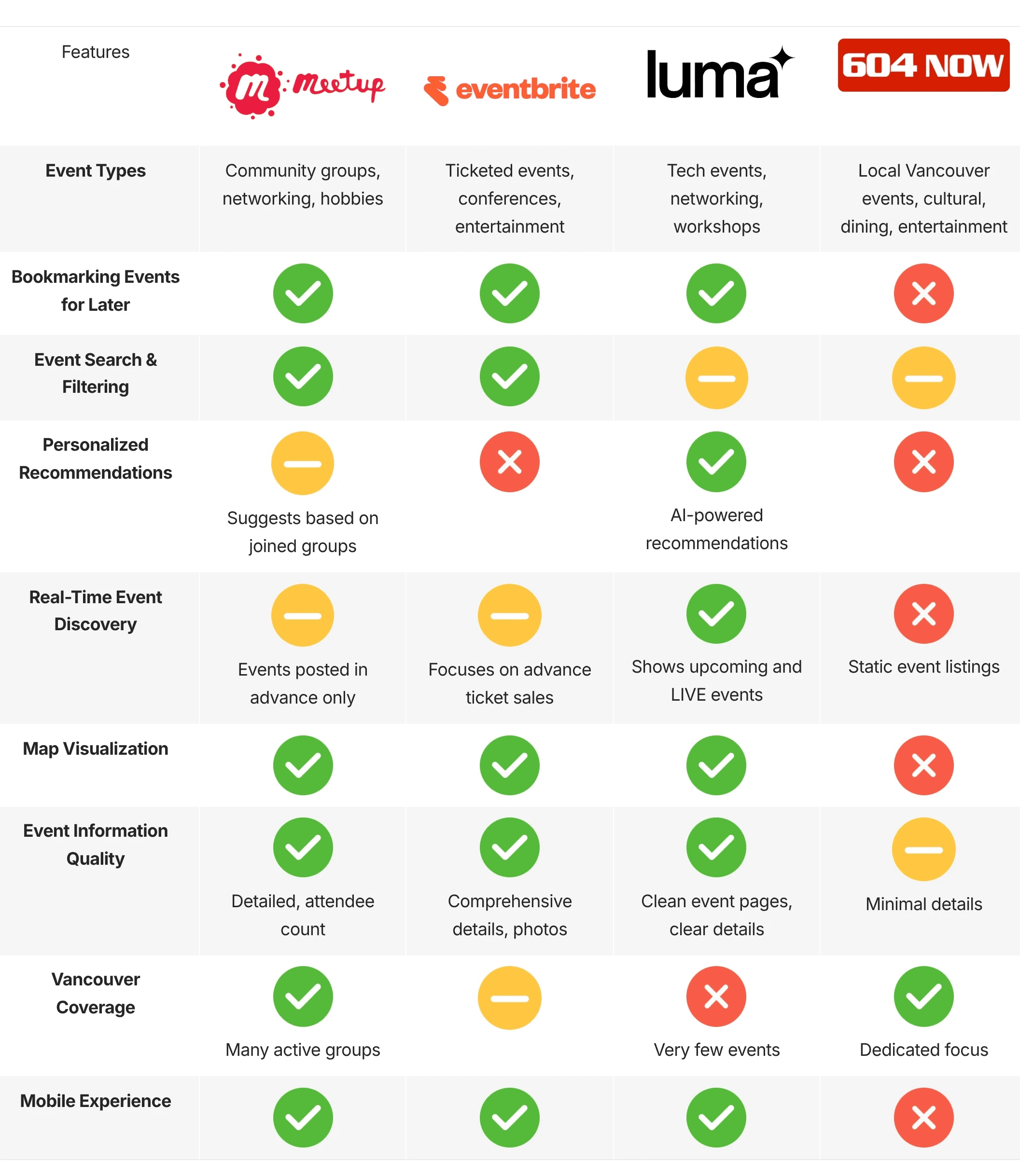
Competitive Analysis
Identifying the Opportunity
Based on the tools Vancouverites reported using, my team and I found that existing platforms only address fragments of the event-discovery experience. While some offered strong filtering or community features, none supported a real-time way to find events. To understand these gaps, four major event platforms were compared.
Core Requirements
Three product requirements emerged from the research:
Centralize
Bring all Vancouver event information into one place.
Surface in Real Time
Show what’s happening now and what’s coming up today.
Reduce Decision Effort
Provide clear details, intuitive filters, and lightweight saving.

Information Architecture
Navigation Model
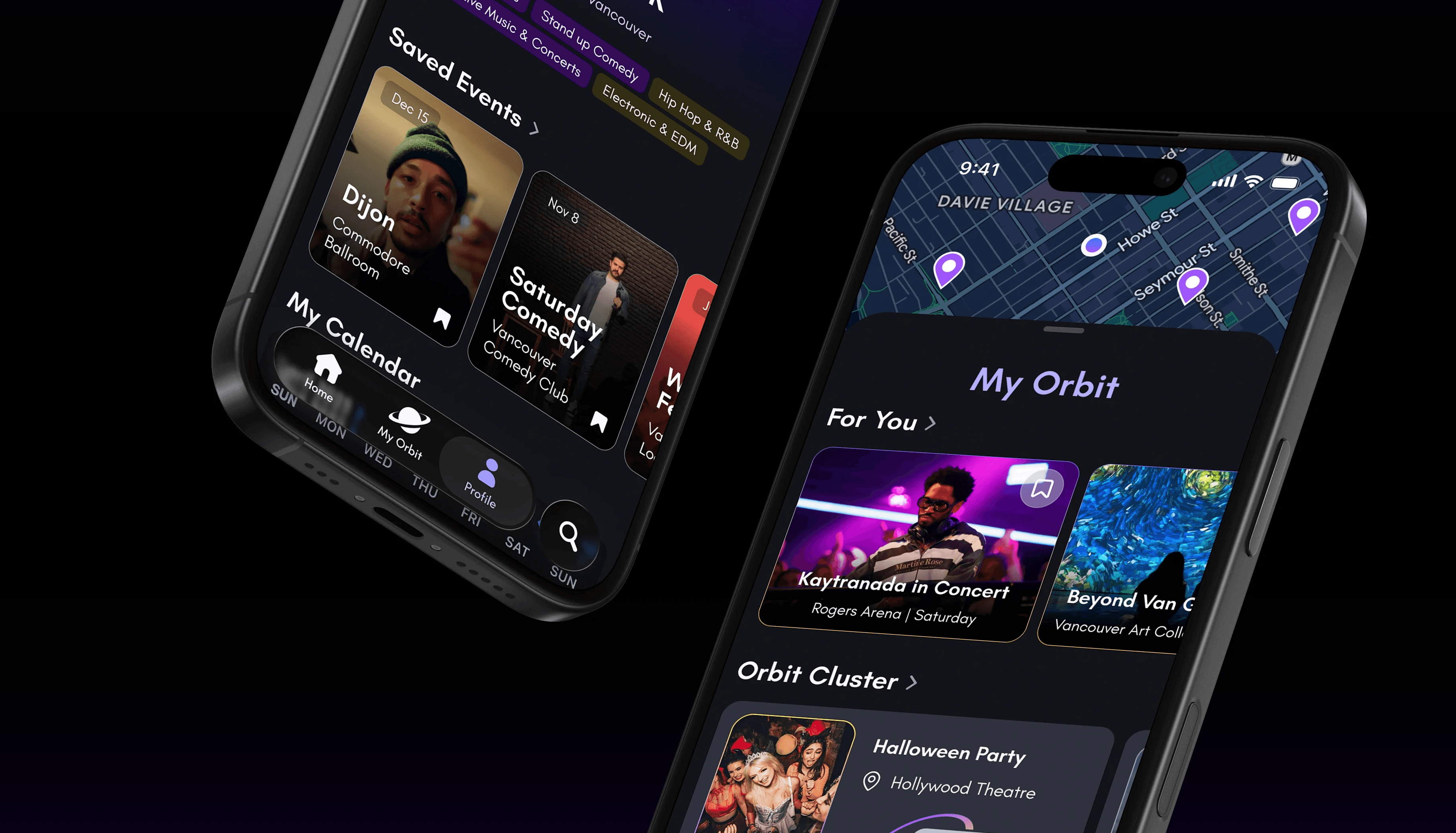
Four Core Features
Home
Near You
Trending
Featured
Recently Added
Upcoming
Your Orbit
Real-Time Map
For You
Orbit Cluster (friends activity)
Followed Venues
Bookmarks
Profile
Bookmarks
Interests
Calendar
Search
Filters
Categories
Categorizing Events
I created a three-level hierarchy to make browsing broad themes or niche interests easy.
Category Level 1
Music & Concerts, Performing Arts, Visual Arts, Food & Drink, Sports & Fitness, Nightlife, Learning, Community, Family, Hobbies, Wellness, Outdoors, Camping.
Category Level 2
(e.g., Music Festivals, Stand-Up Comedy, Wine Tastings, Hiking & Outdoor Fitness, Trivia Nights, Workshops, LGBTQ+ Events, Family Activities)
Category Level 3
More granular subtypes such as Indie & Singer-Songwriter, Art Installations, Farmers Markets, Meditation, Nature Walks.

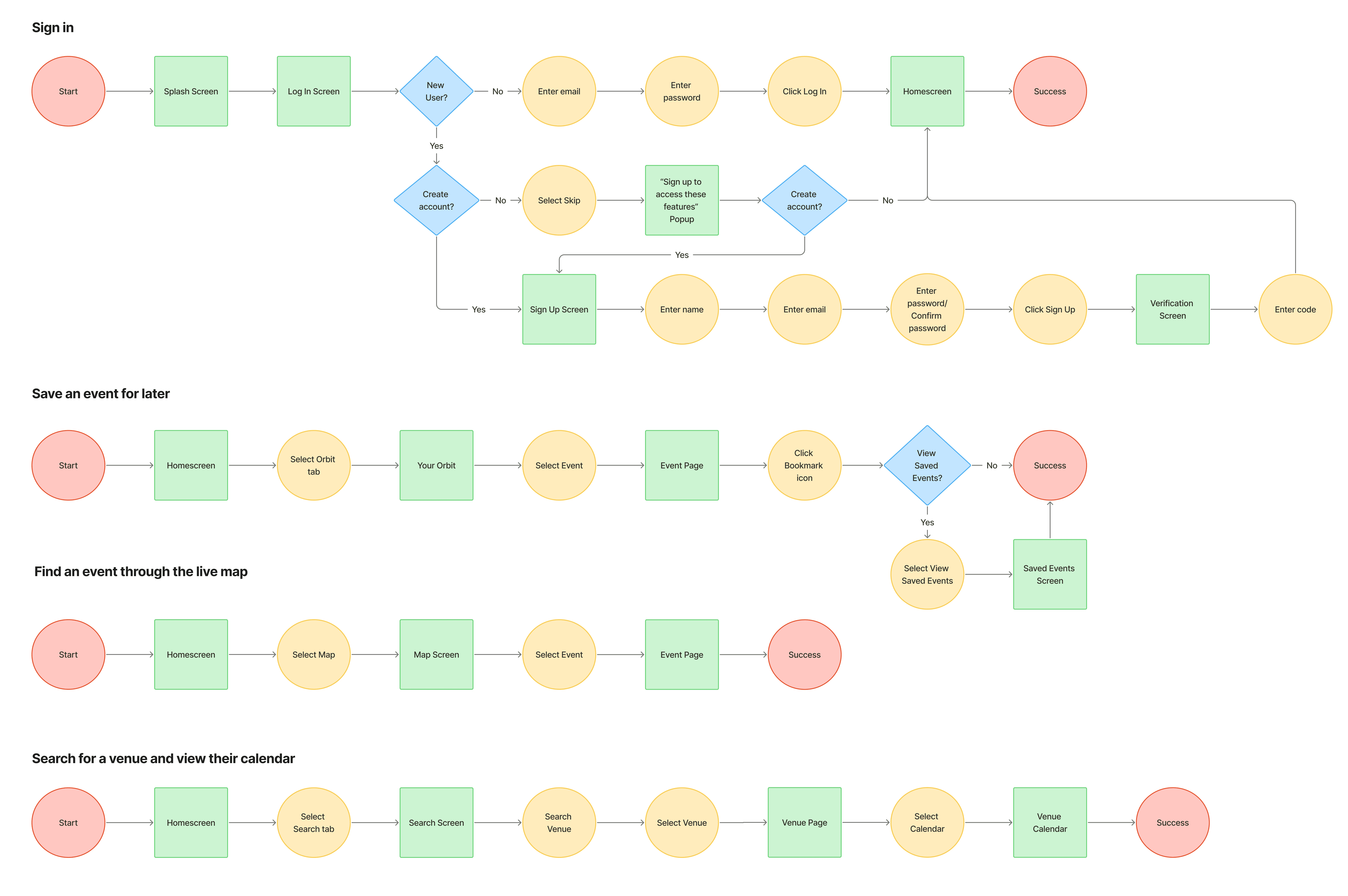
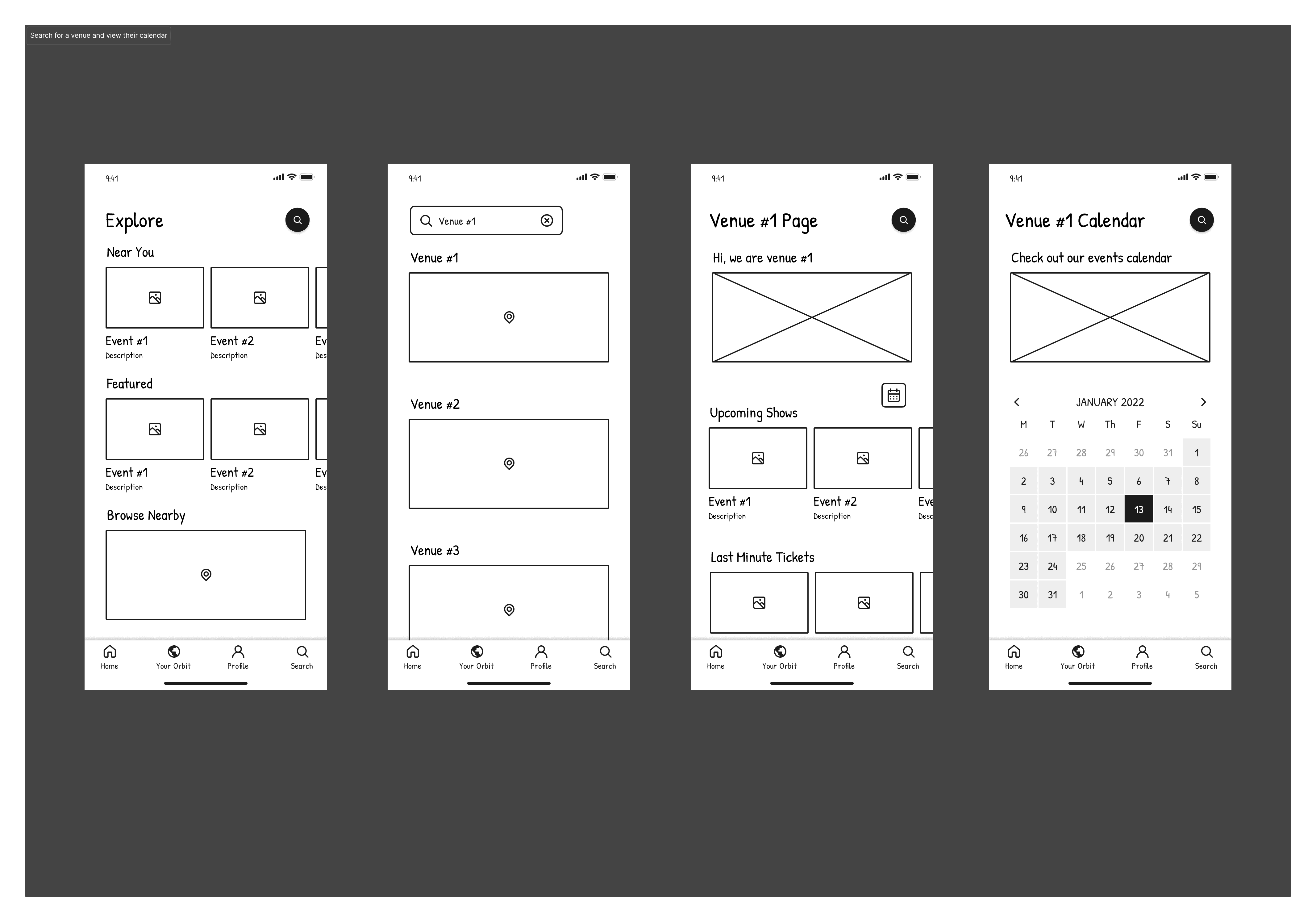
Task Flows
How Users Move Through Orbit
These are the four main tasks that my team and I focused on for the minimum viable product

User Flows
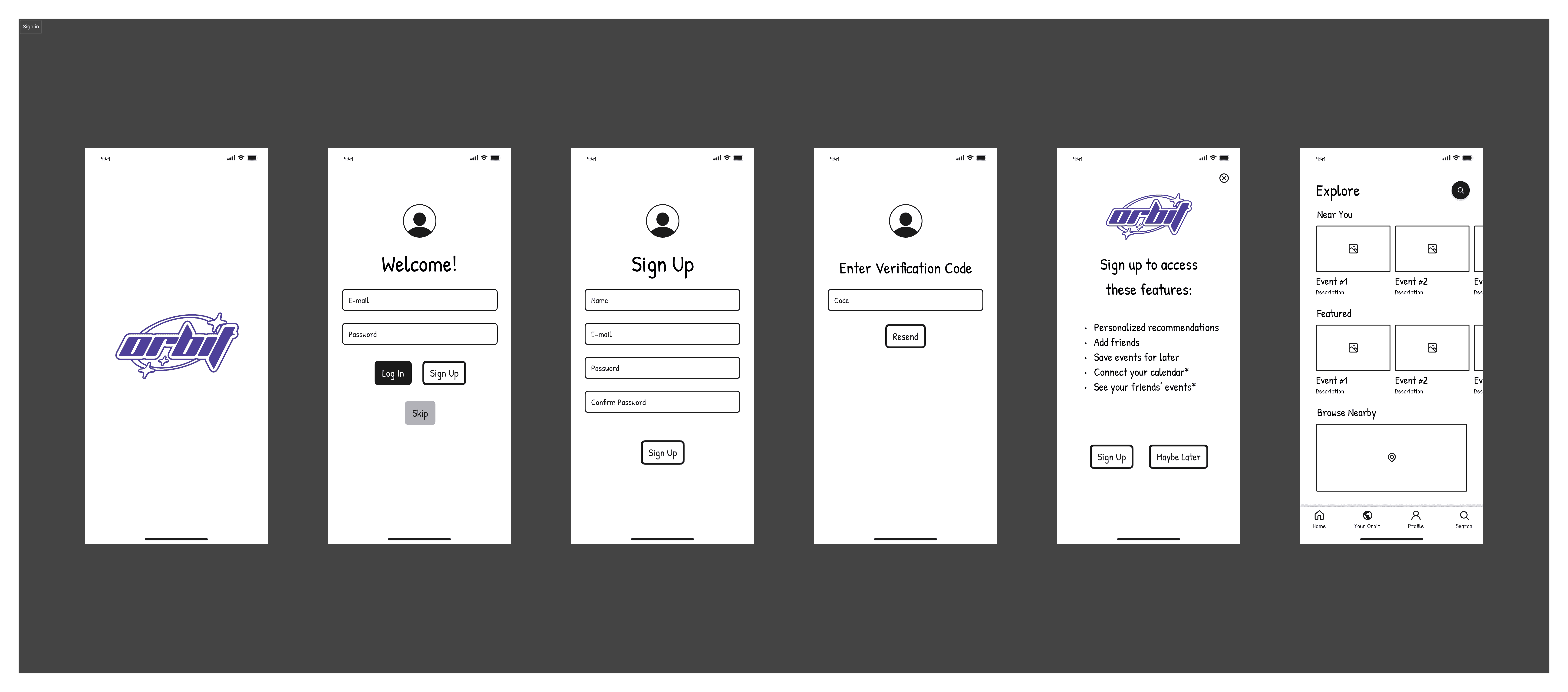
Usability Testing & Iteration
My team and I ran in-person usability tests using low-fidelity wireframes to evaluate navigation and feature understanding before moving to high-fidelity designs. We tested whether users could:
Understand the difference between Explore and Your Orbit
Find and save an event
Use the map without confusion
Testing Focus
6 participants
Scenarios:
You are signing into Orbit for the first time, you want to see what local events are happening this weekend.
You found an event that looks interesting but you can’t attend today. What would you do to save or bookmark it for later?
You want to check events that are recommended for you personally. Where would you go?


Insight
Participants were unsure which screen was the homepage and found some labels unclear, such as “Orbit” and “Overlap.” They expected personalized recommendations under “My Orbit” and wanted better terminology overall. For recurring events, they suggested email notifications after saving.
Design Changes
To reduce confusion around navigation and labels, “Orbit” was renamed to “My Orbit,” and “Overlap” was changed to “Orbit Cluster” to better connect it to the My Orbit section and clarify that it shows events friends are attending. Searchable filters were prioritized over long scrolling lists,.
Design
Brand Design
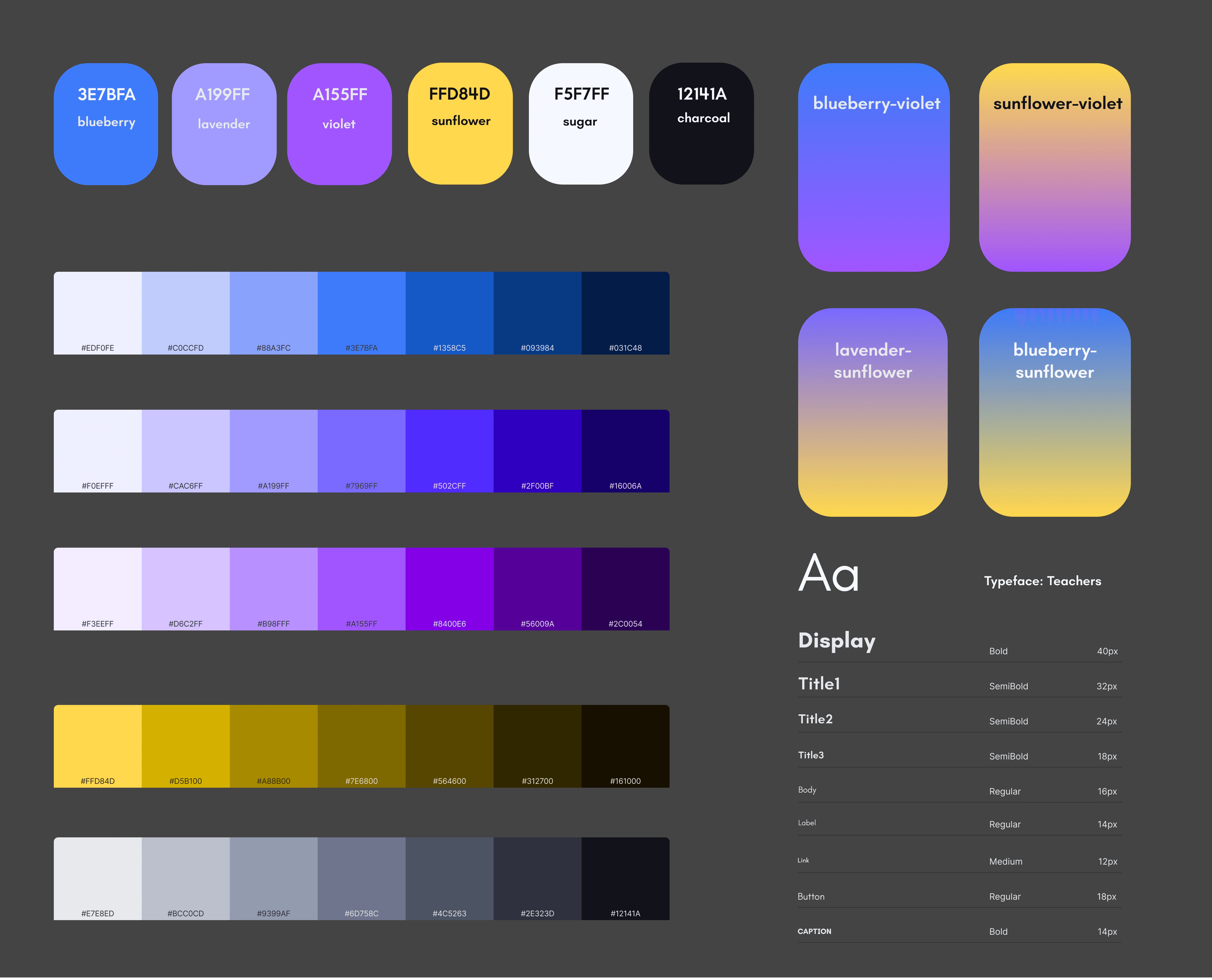
The Visual System
The brand direction was developed collaboratively, with the logo designed by a teammate. I led the visual system by creating the colour palette, defining all type styles, and structuring semantic variables and design tokens in Figma to help the team work consistently. UI components and icons were designed collaboratively; I contributed several core card patterns and custom icons that supported the space-inspired theme.
Instead of using a UI kit, the interface was built from scratch to support a dark mode experience inspired by space, nightlife, and entertainment.
Colour
Created colour tokens using naming conventions (e.g., color/brand/lavender/300)
Text
Defined semantic text variables (text-primary, text-secondary) and scalable type styles for display, title, body, and label.
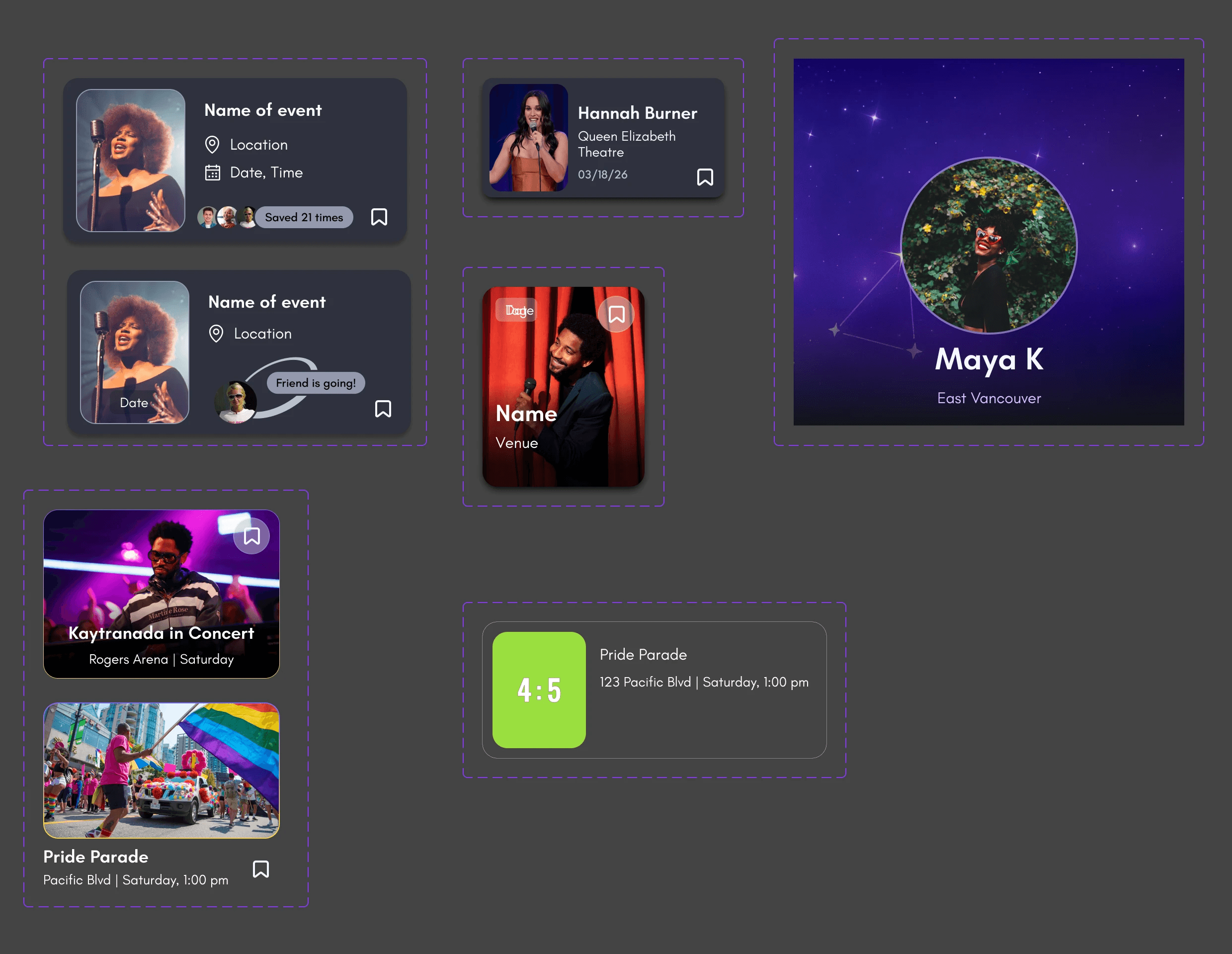
Components
Built reusable components to ensure consistency across flows.

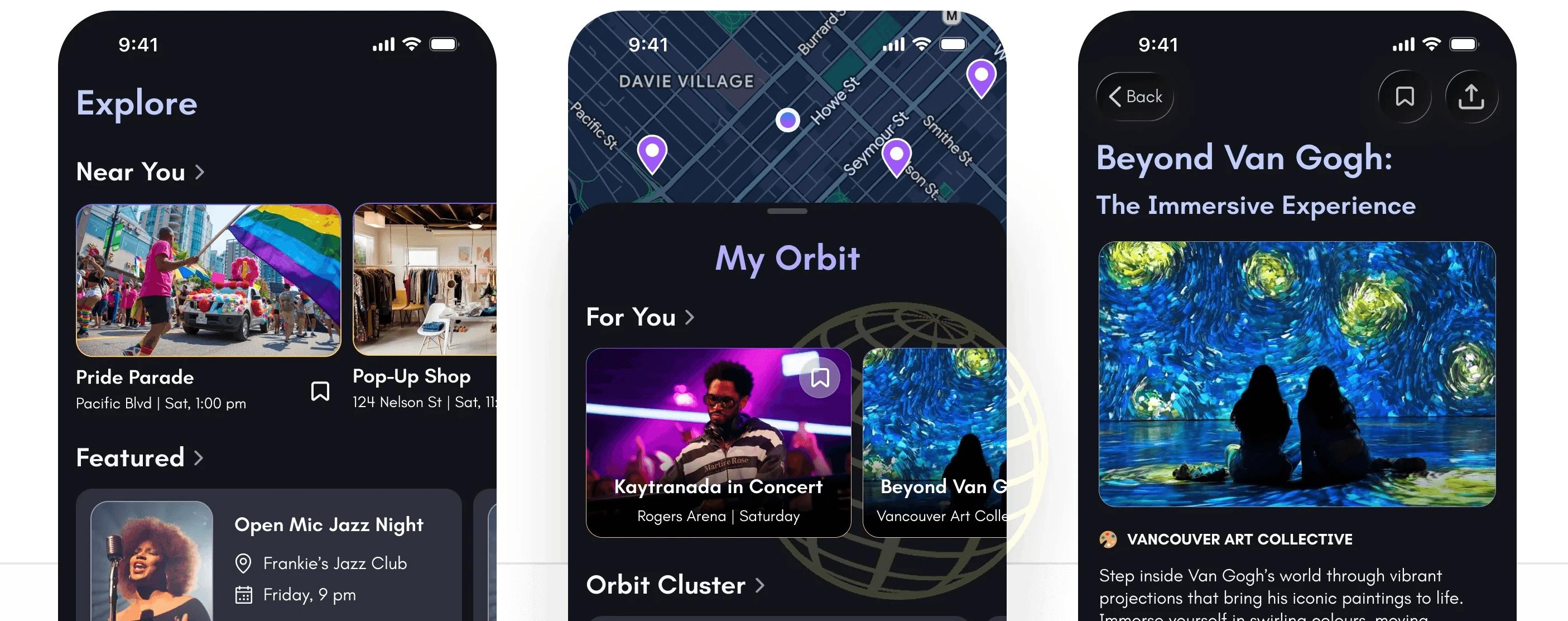
High-Fidelity Wireframes
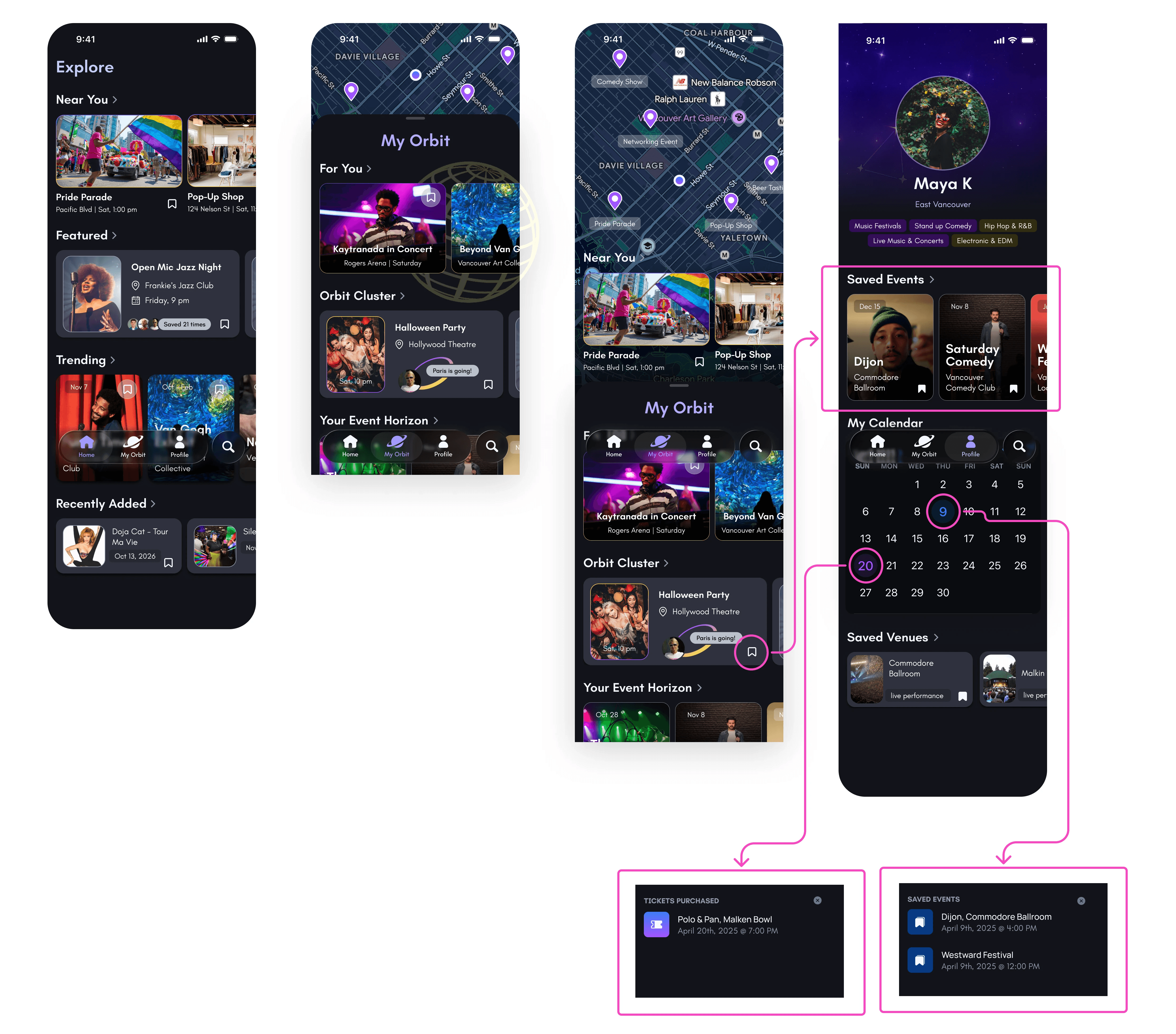
Since users wanted to save events they were not ready to purchase but did not want to forget, a calendar view was added to the profile page. Days are colour-coded: purple for saved events and blue for purchased tickets. If a date includes multiple events, a count indicator appears. Clicking a date opens a modal showing the relevant events for that day, clearly labelled as Saved or Attending, with access to full event details.
Motion and micro-interactions were used intentionally to create a sense of energy and delight while reinforcing the space-inspired theme.

Outcomes & Learnings
This project reinforced the importance of letting research guide direction, even when it requires a pivot. It showed that terminology must be tested alongside interaction and layout, as language directly affects usability. Working through team changes strengthened my communication and ownership skills. It also deepened my understanding that product design must consider technical feasibility, data reliability, and long-term sustainability, not just the interface.
Outcomes
Event discovery, not community-building, was the core user need.
Users missed events because information was fragmented and hard to track.
A low-commitment save feature (calendar view) addressed fear of missing out.
Next Steps
The next phase would begin with partnering with local venues and securing access to their event calendars. From there, API integrations and real-time updates would be explored in more detail, along with long-term maintenance needs. The high-fidelity prototype would also be tested with users before development to refine key flows and language. Success would be measured through event saves, repeat usage, and ticket purchases.