West Coast Seeds
Redesigning a Quiz for Octane AI
UI redesign of a high-performing Octane AI product quiz, rebuilt mobile-first and aligned to brand.


Project Overview
This quiz is one of our top revenue-driving tools on the website, and the first of several getting redesigned. We were promoting it with a QR code on posters distributed to retailers across the country, so most users would land on it from their phone. It needed to work flawlessly on mobile, match our branding, and feel easy to use.
I designed the UI for both desktop and mobile in Figma, then handed it off to our developer to build in Octane.
My Role
UI/UX Designer
My Responsibilities
UI Design
Responsive Design
Design Systems
Type of Project
E-commerce Quiz
Tools
Figma
Figma Make
Platforms
Website
Mobile
Where We Started
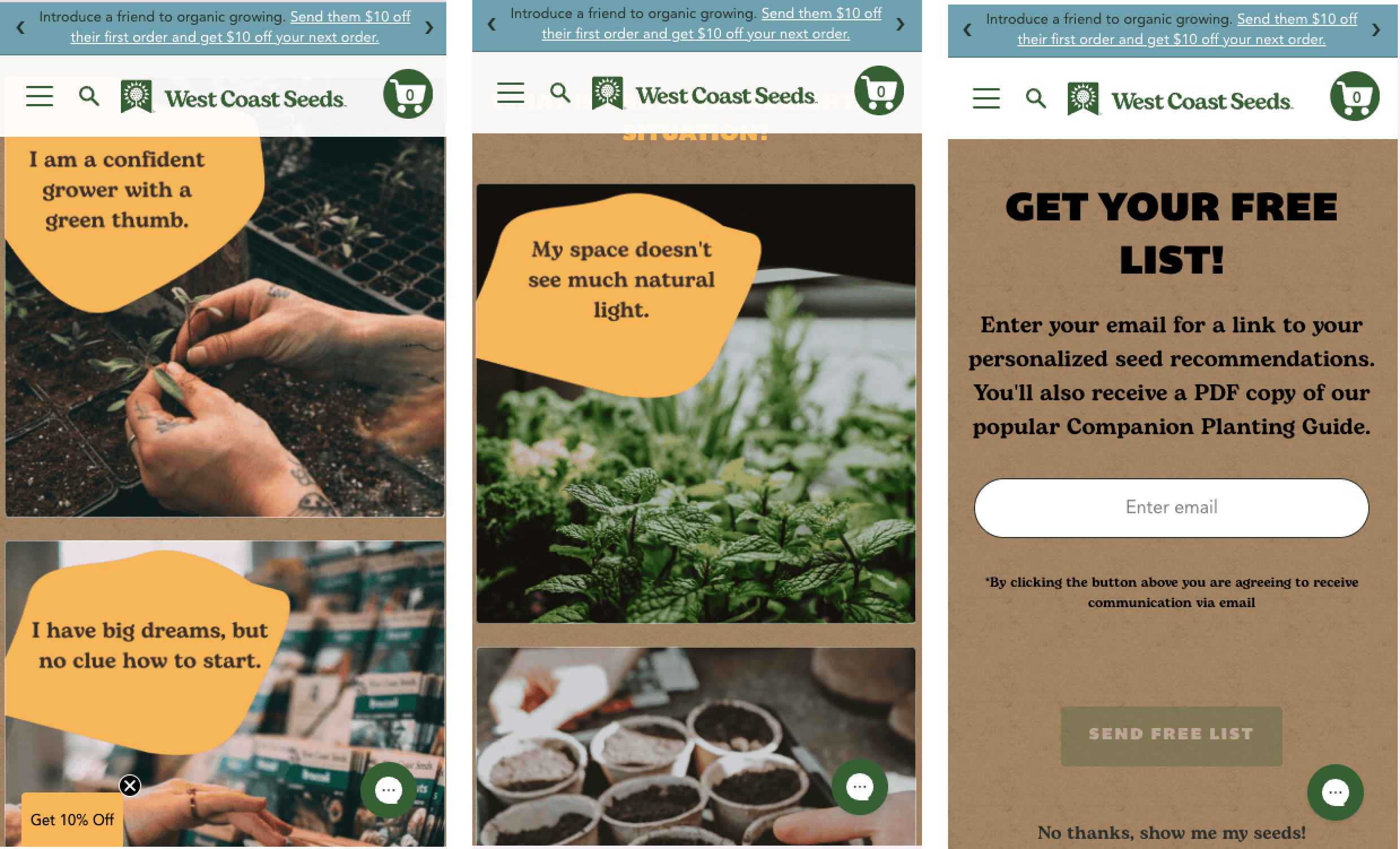
The original quiz worked, but the design was starting to hold it back. On some screens, answer options ran below the fold with no clear cue to scroll, so users could miss options entirely. The layout also couldn't adapt well to a varying number of results, and the visual style didn't match our current brand.

Designing the System
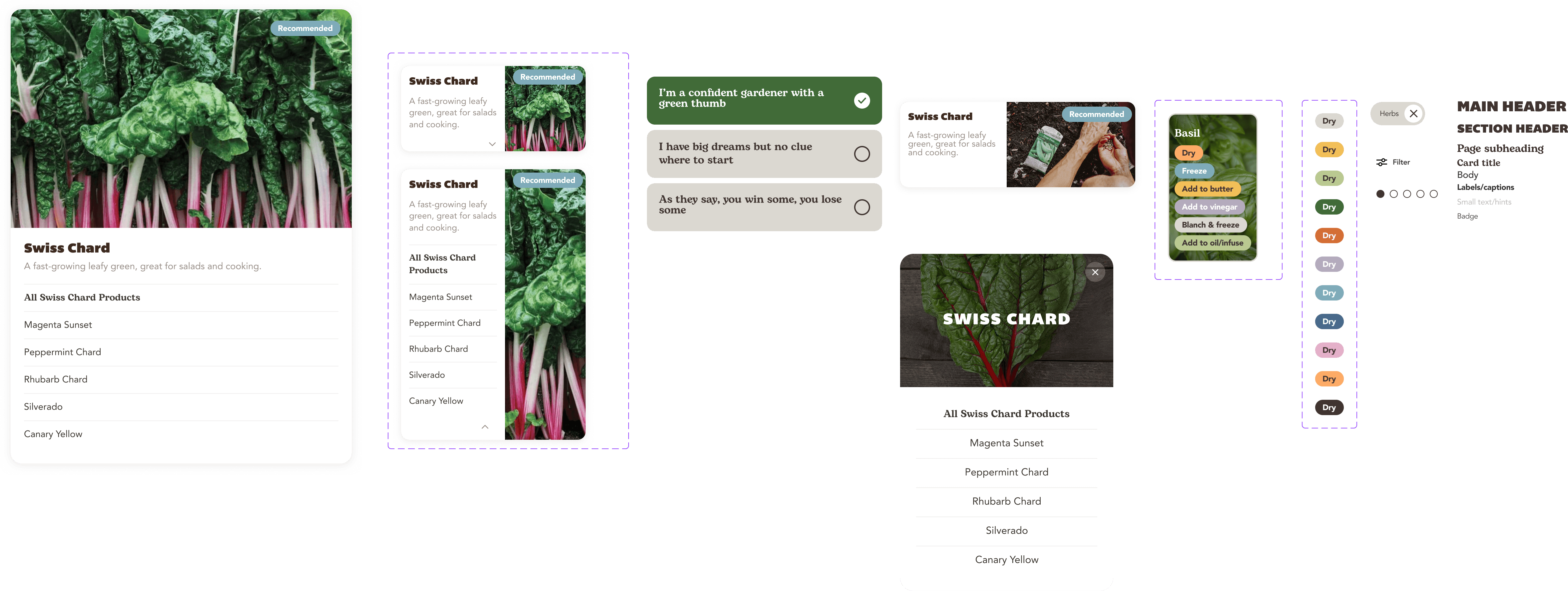
My first version stayed close to the original layout, cleaner UI, but a similar structure. Once I tested it against a larger set of possible results, I saw it break down. The number of recommended products varies by user, along with the answers to the questions, and the fixed grid couldn't handle that well.
I got feedback from our senior designer, who suggested leaning into our photography and making the images more prominent. I revised the design around that, so it could handle any number of recommendations without breaking the layout. Since result counts vary across all our quizzes, this pattern will carry over as the redesign rolls out to the rest.


Design Decisions
Keeping button position consistent. I placed "Send Free List" in the same position as the "Next" button users had been tapping throughout the quiz. Keeping that muscle memory intact made users more likely to tap through and enter their email, instead of pausing to look for a new button in a new spot.
Keeping the skip option quiet. I kept "No thanks, show me my seeds" on the email screen for users who didn't want to opt in, but styled it to sit below the primary action, so it wouldn't compete with our email capture goal.
A second chance to opt in. I proposed a "Save your seeds list for later" CTA at the end, giving us a second shot at capturing email from users who'd skipped it earlier. I checked feasibility with our developer, who flagged that Octane might not support a second capture point. His team tried, but it wasn't possible, so we cut it for this launch. It's worth revisiting elsewhere on the site.
Carousel or modal? The team proposed a carousel for the results page. I suggested a different approach for mobile: a carousel hides results behind a swipe, and many users won't scroll past the first few cards. A list keeps every recommendation visible at once, which is more likely to drive clicks, and a modal on tap is a familiar mobile interaction. We landed on a list with modal for mobile, and kept the carousel for desktop.


Live Project
Take The Seed Matchmaking Quiz
The redesigned quiz is live on the West Coast Seeds website. Click the link below to view it! This redesign is now the template for the rest of our Octane quizzes. I'll update this case study with performance data once it's available.
